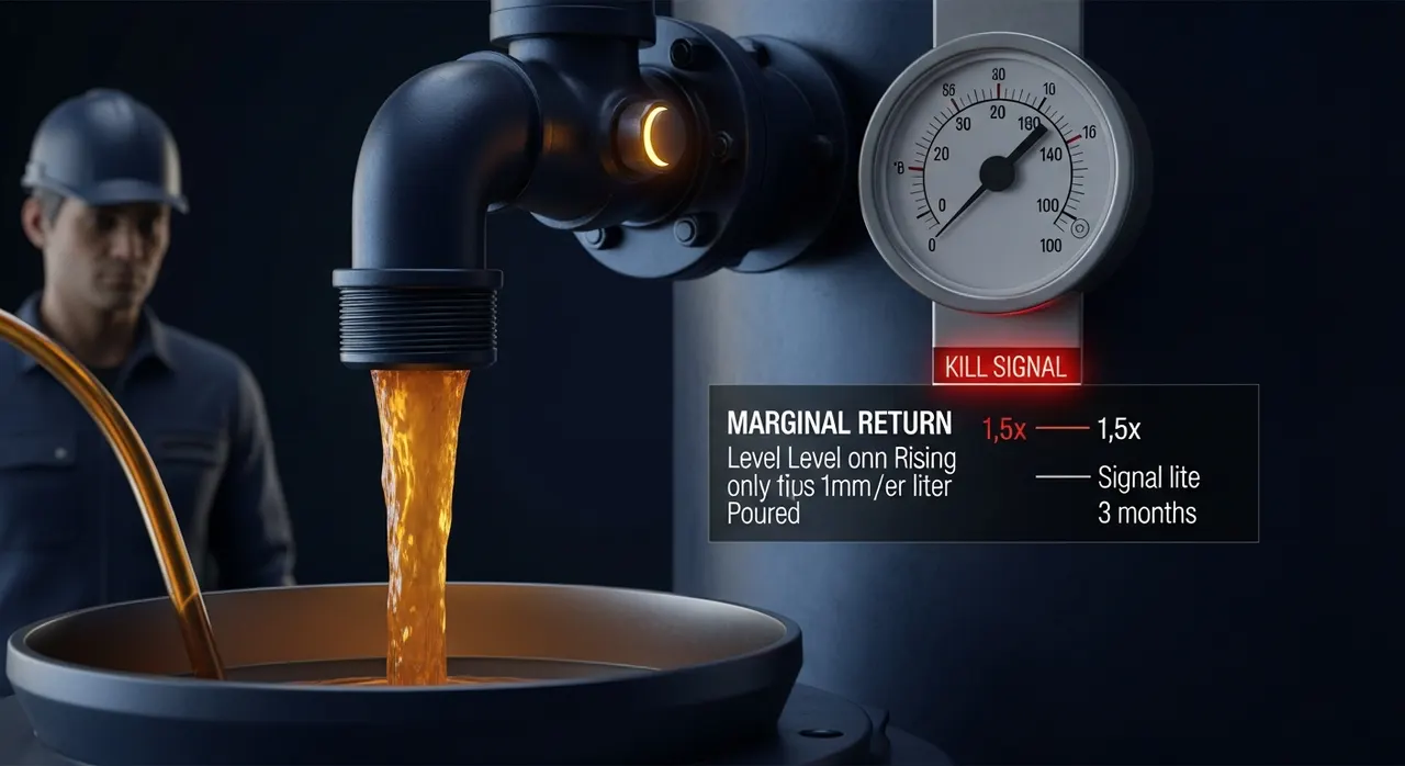
Most product-page advice is a checklist: bigger photos, more reviews, sticky add-to-cart, trust badges, a cleaner layout. All true, none prioritized. So operators do the expensive, visible thing — a full PDP redesign — and skip the cheap thing that actually clears the biggest purchase blocker. This is a spending decision, not a design opinion. Below is a ranking of PDP elements by conversion impact against effort, a named list of what is theater at your revenue, and a one-thing verdict with the reasoning.
The short answer
- The decision: where to spend a limited PDP budget — cosmetic redesign vs. clearing the specific questions that stall a purchase.
- Highest-ROI fix: surface delivery cost, delivery date, and return terms on the product page itself (not just at checkout). Extra costs are the single most-cited abandonment reason at 40% of shoppers (Baymard, 2025), and this is a template-and-copy change, not a rebuild.
- What's theater: full PDP redesigns, hero animations, parallax, bespoke fonts, and "brand refresh" passes — high effort, near-zero conversion movement at a $50K–$5M store.
- Bottom line: the PDP's job is to answer the buyer's open questions before they hit the first unanswered one. Rank spend by which blocker each element removes and how many buyers hit it — not by how the page looks in a redesign mock.
Why does the "product page" even decide the sale?
The product page is where intent becomes a decision. A buyer who reaches it has already filtered category, price band, and often brand. They are not browsing — they are checking whether this specific item survives their remaining objections. Every objection you leave unanswered is a place they leave.
That is why the industry-wide state of PDPs matters. Baymard Institute's product-page research finds 51% of e-commerce sites have "mediocre" or worse product-page UX, and no site tested reaches a "perfect" or "state of the art" implementation — this after 2+ years of testing that logged 1,300+ product-page usability issues on major retailers (Baymard, 2025). The takeaway is not "everyone is bad." It is that the bar is low and mostly missed on fundamentals, not on polish. The gap is in answering questions, not in visual sophistication.
So the useful mental model is not "how do I make this page beautiful." It is: what does this buyer still need to know to say yes, and in what order do they ask? Roughly, in sequence: Is this the right thing? Can I trust it's real and good? What exactly will I get? What will it cost me — to receive it, and to be wrong? Can I buy it right here? Conversion is lost at the first question the page fails to answer. That ordering is the spine of the framework below.
Which PDP elements actually move conversion?
Rank each element two ways: the impact (does it remove a blocker a large share of buyers actually hit?) and the effort (template change vs. operational program vs. full redesign). The ratio is what you fund first.
| PDP element | Conversion impact | Effort | Verdict |
|---|---|---|---|
| Delivery + return clarity on the PDP | High — clears the #1 abandonment driver | Low — copy + template | FUND FIRST |
| Above-the-fold hierarchy (price, variant, CTA, key specs) | High — clears the fastest blockers | Low–Medium — template | Fund early |
| Reviews / social proof (volume + display) | High — up to 270% purchase lift | Medium — acquisition program | Fund, but it is a program |
| Product imagery (angles, scale, zoom, in-context) | Medium–High — answers “what exactly?” | Medium — production | Fund by category |
| Trust signals (stock, secure pay, returns badge) | Medium — removes friction, not desire | Low — components | Cheap, do it |
| Cosmetic redesign / hero animation / parallax | Near-zero — moves no blocker | High — design + dev | THEATER — defer |
Delivery and return clarity — the underpriced winner
The largest documented reason buyers abandon is cost surprise: 40% cite extra costs (shipping, tax, fees), and returns policy (13%) and inability to see the total up front (12%) appear on the same list (Baymard cart abandonment, 2025). Operators read those as checkout problems. They are not. They are expectation problems that start on the PDP. If a buyer cannot estimate landed cost and return risk before they add to cart, you have simply moved the abandonment one screen later — and paid for the extra step.
Nielsen Norman Group's product-page research makes the fix explicit: acknowledge and estimate delivery charges and timeframes on the product page, near the price — a flat rate, a minimum, or an estimate — rather than deferring all cost information to checkout (NN/g, 2024; see also NN/g on displaying fees). Because: the buyer's "what will it cost me" question is a hard blocker, and answering it late converts a maybe into an exit. How: add a delivery-estimate line and a plain-language return window beneath the buy box. It is a theme edit and a copy decision — days, not a redesign quarter. This is why it wins on ratio, and why most stores skip it: it is invisible in a design review.
Above-the-fold hierarchy — the cheapest structural lever
Buyers answer their first questions in seconds. If price, the variant selector, the primary CTA, and two or three decision-critical specs are not resolvable without scrolling, you lose people before the good parts load. This is not "put everything above the fold" — it is sequence the fold to the buyer's question order. Because: the earliest blockers ("is this the right thing, what does it cost") are also the most fatal if unanswered. How: audit your PDP at 375px first — the mobile fold is where the real constraint lives, not the desktop mock (the mobile web vs. app trade-off shapes how much fold you actually get). Most fixes here are CSS and content ordering.
Reviews and social proof — high impact, but it is a program
The single most-cited PDP statistic is real and large: purchase likelihood for a product with five reviews is 270% higher than one with none, per Northwestern's Spiegel Research Center — with lift reaching 380% on higher-priced items and peaking when ratings sit in the 4.0–4.7 range, not at a suspicious 5.0 (Spiegel Research Center, 2017). But note what that requires: review volume and honest display. That is an acquisition and operations program (collection flow, incentives, moderation, platform choice), not a template edit — which is why it ranks high on impact but sits behind delivery clarity on effort. Choosing where those reviews live is its own decision; see the reviews platform decision. Because: the lift is only unlocked once you cross a volume threshold per SKU. How: instrument review-request timing first, then choose display, then optimize.
If you fix one thing, fix this
What's just theater?
Theater is any PDP change that is highly visible in a design review but clears no purchase blocker. At a $50K–$5M store — where you do not have surplus design/dev cycles — these are the recurring money sinks:
- Full cosmetic PDP redesigns. A "refresh" that re-skins the same information without changing what questions get answered, in what order. Because: buyers do not abandon over aesthetics that already clear the bar; they abandon over unanswered cost, fit, and trust questions. High effort, no blocker moved.
- Hero animations, parallax, and scroll-triggered motion. They add weight and layout shift — directly taxing the Core Web Vitals that gate ranking and mobile patience — while answering nothing.
- Bespoke fonts and heavy brand typography on the PDP. A render-blocking flourish that delays the fold. The fold's job is to answer questions fast, not to express the brand.
- "Sticky everything" and mega-galleries with no scale reference. Twelve near-identical photos that never show the product's size in context answer fewer questions than three that do.
- Micro-interactions on the add-to-cart button. A bouncing cart icon does not resolve "will this fit" or "what will shipping cost."
The tell of theater
None of this means brand or beauty is worthless. It means at your scale, aesthetics are a floor to clear once, not a lever to pull repeatedly. Once the page is clean and credible, further polish has sharply diminishing returns — while the delivery-clarity line you never added is still bleeding 40%-tier abandonment.
How should you prioritize a limited budget?
Fund in ratio order, not visibility order. Concretely:
- Delivery + return clarity on the PDP (days, template + copy). Highest ratio. Attacks the biggest documented blocker.
- Above-the-fold hierarchy at 375px (days, CSS + content order). Cheap, structural, compounds with everything else.
- Trust signals — real-time stock, secure-payment mark, visible return window (days, components). Cheap friction removal.
- Reviews program (weeks–quarter, operational). High impact, but treat as a program with its own owner and metric.
- Imagery upgrade by category (weeks, production). Fund where "what exactly am I getting" is the dominant blocker — apparel, furniture, anything where fit or scale decides the sale.
- Redesign / motion / typography — only after 1–5, and only when the page fails the clarity bar, not the fashion bar.
Two guardrails. First, measure the right thing: conversion rate is an output, and chasing it as a top-line number invites vanity optimization — read why conversion rate is a vanity metric before you set a PDP KPI. Track blocker-specific signals instead: add-to-cart rate (fold + trust), PDP→checkout rate (cost expectation), and post-add abandonment (cost surprise). Second, the PDP does not exist alone — if buyers cannot find the right product, no PDP converts; the ROI of site search and navigation often outranks a PDP redesign for stores with deep catalogs.
Key Takeaway
One more structural point. AI shopping assistants now sit upstream of your PDP for a growing share of buyers, and they recommend products whose facts — price, availability, delivery, returns — are machine-verifiable. The same delivery-and-return clarity that clears the human blocker also makes the product citable by an assistant. Fixing it once serves both audiences; see AI product discovery for how that data layer works. And because cost-surprise abandonment continues into the funnel, pair the PDP fix with the checkout and cart-abandonment work — the two share the same root cause.
FAQ
Should I invest in a full PDP redesign or targeted fixes?
Targeted fixes first, almost always, at $50K–$5M GMV. A full redesign is high-effort and rarely moves a blocker that targeted changes can't move for a fraction of the cost. Baymard's finding that 51% of sites are "mediocre or worse" reflects missed fundamentals (delivery clarity, hierarchy, review volume), not missing visual polish. Redesign only when the page genuinely fails the clarity bar — buyers can't find price, specs, cost, or trust — not when it merely looks dated.
What single change gives the fastest conversion lift on a product page?
Surfacing delivery cost, delivery date, and return terms directly on the PDP, under the buy box. Extra costs are the most-cited abandonment reason at 40% of shoppers (Baymard), and this is a template-and-copy change measurable within a week — no redesign, platform, or headcount required. Start with your top 20 SKUs by traffic.
How many product reviews do I actually need before it matters?
The steepest lift comes from moving zero to about five reviews per SKU — purchase likelihood is roughly 270% higher at five reviews than at none (Spiegel Research Center), and the marginal benefit of each additional review drops rapidly after that. Prioritize getting every active SKU past five honest reviews before you chase hundreds on your hero products. Ratings that peak in the 4.0–4.7 range convert better than a perfect-looking 5.0.
Are trust badges and hero animations worth the effort?
Split them. Genuine trust signals — real-time stock status, a clear return window, a recognized secure-payment mark — are cheap components that remove friction, so ship them. Hero animations, parallax, and add-to-cart micro-interactions are theater: high effort, no blocker cleared, and they tax Core Web Vitals and the mobile fold. Defer them until the clarity fundamentals are done.
Does product-page conversion work carry over to mobile automatically?
No. The mobile fold is far smaller, so hierarchy decisions that pass on desktop routinely fail at 375px — the exact place cost, variant, and CTA need to resolve. Audit and prioritize the PDP mobile-first, then confirm desktop. How the mobile experience is delivered also matters; see the mobile app vs. mobile web trade-off.